
Economists sure love their charts, as any student who survives Econ 170 has learned. Data visualization isn’t just the decorative frosting on lesson plans and published papers. It is an absolutely essential interface between people and data. Briefly consider this data on annual percent change in GDP in the United States from FRED:
| DATE | VALUE |
|
1955-01-01 |
7.125955765883840 |
|
1956-01-01 |
2.131213376900720 |
|
1957-01-01 |
2.102826706703490 |
|
1958-01-01 |
-0.731728665207882 |
|
1959-01-01 |
6.898619218085940 |
|
1960-01-01 |
2.566027153202800 |
|
1961-01-01 |
2.554101761976380 |
|
1962-01-01 |
6.114879435404820 |
|
1963-01-01 |
4.355504976980980 |
|
1964-01-01 |
5.767719183950940 |
|
1965-01-01 |
6.497636614399920 |
|
1966-01-01 |
6.595334041630260 |
|
1967-01-01 |
2.743014189834750 |
|
1968-01-01 |
4.909046030916900 |
|
1969-01-01 |
3.139619503066850 |
|
1970-01-01 |
0.202123088186139 |
|
1971-01-01 |
3.295743329097830 |
|
1972-01-01 |
5.262807206376060 |
|
1973-01-01 |
5.643390319077960 |
|
1974-01-01 |
-0.516677958914673 |
|
1975-01-01 |
-0.198293195948870 |
|
1976-01-01 |
5.386836510161830 |
|
1977-01-01 |
4.608445145318870 |
|
1978-01-01 |
5.561731514232780 |
|
1979-01-01 |
3.175261679857030 |
|
1980-01-01 |
-0.244347530234140 |
|
1981-01-01 |
2.594412749596940 |
|
1982-01-01 |
-1.911148048808150 |
|
1983-01-01 |
4.632757046959200 |
|
1984-01-01 |
7.258907538280310 |
|
1985-01-01 |
4.238489229618300 |
|
1986-01-01 |
3.512075640654210 |
|
1987-01-01 |
3.461611856752120 |
|
1988-01-01 |
4.204067579863760 |
|
1989-01-01 |
3.680158121423100 |
|
1990-01-01 |
1.919449147116980 |
|
1991-01-01 |
-0.073701636790531 |
|
1992-01-01 |
3.555094891000390 |
|
1993-01-01 |
2.745897880009270 |
|
1994-01-01 |
4.037916185274650 |
|
1995-01-01 |
2.718705359170960 |
|
1996-01-01 |
3.796162067864080 |
|
1997-01-01 |
4.486791023577310 |
|
1998-01-01 |
4.449765968726340 |
|
1999-01-01 |
4.685327578166540 |
|
2000-01-01 |
4.092110824720890 |
|
2001-01-01 |
0.976141851086625 |
|
2002-01-01 |
1.786157818998980 |
|
2003-01-01 |
2.806811645566690 |
|
2004-01-01 |
3.785481233658090 |
|
2005-01-01 |
3.345379434020840 |
|
2006-01-01 |
2.666455907406440 |
|
2007-01-01 |
1.778798122322720 |
|
2008-01-01 |
-0.291621144633987 |
|
2009-01-01 |
-2.775553551410540 |
|
2010-01-01 |
2.531772865192880 |
|
2011-01-01 |
1.601584166452490 |
|
2012-01-01 |
2.320816613212190 |
|
2013-01-01 |
2.219377422665830 |
|
2014-01-01 |
2.389041566745340 |
Get much out of that? Probably not. Now, look at this visualization of data:
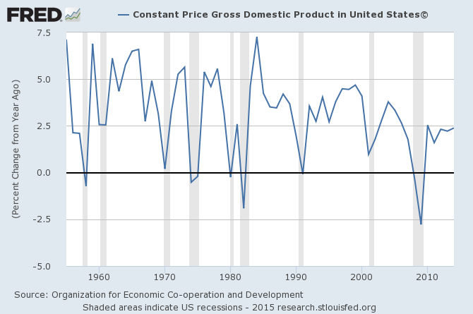
Get more out of that? A lot more? Probably. The point is: presenting data in a human-friendly manner is important; people have a hard time performing meaningful analysis of untreated data. However, data visualization is old hat. The new kid on the block is sonification, or the sonic representation of data. You may be scratching your head, but I am sure that you have encountered it before. Click over here. It’s a recording of a Geiger counter, which represents the intensity of radiation through click-frequency. Thus, the user can get a real-time sense of this otherwise invisible phenomenon. That same information could very well be represented visually (i.e. by a flashing light), but nevertheless a sonification is employed because sound provides a more tangible and meaningful interface with the frequency information. Sonification is employed to represent data in more academic settings, as well. The proponents of sonification hope that this method, by allowing individuals a new way to interact with data, will allow them to perhaps pick out new trends or patterns in the data. Click over to Foreign Affairs. They have a few great examples of sonification of economic data, including the “Bacon Cheeseburger Inflation Index” and sales of gold and silver coins. It took me a few listens to get a handle on what was going on, so don’t be shy with the replay button. Sonification can be a little more tricky to put together effectively than building a chart on Microsoft Excel and a little more tricky for unfamiliar ears to comprehend. And, unlike a visualization, it cannot be directly printed into a paper. Keep it somewhere in the back of your toolbox, though; it may come in handy someday.
(I was inspired to share this bit on sonification by a recent episode of the podcast Actuality.)
Excellent piece on an important new trend–rendering data into sound to better apprehend some event. Any thoughts on the choice to represent the data sonically instead of visually? That is, are there intrinsic benefits sound offers that could not be found in a visual chart?