
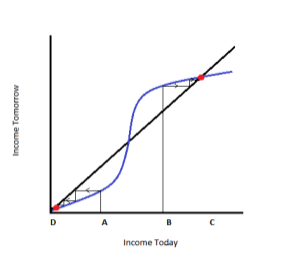
The discussion of the presence of poverty traps in certain impoverished areas has been a very important and somewhat controversial developmental economic idea for decades. It is most frequently described as a self-reinforcing mechanism that causes poverty to persist. As further explained in Poor Economics by Abhijit Banerjee and Esther Duflo, your income today influences what your income will be in the future. The amount of money you have today determines what you eat, how much money spent on health, education, ways to improve your work, etc., which in turn influences your income in the future. The poverty trap is seen as an “S-shaped” curve: the poor are stuck on the left side of the graph below the diagonal line, wherein future income is lower than present income, and it continues to decrease over time. This is one explanation for why social mobility is much lower for impoverished people than their counterparts with a higher income.
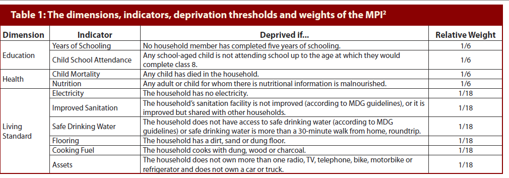
Many economists question the validity of the poverty trap and argue that poor people earn more income than what they started with, though the income may be very low. Economist María Emma Santos proposes that poverty traps should be measured by taking conditions necessary for human development into account, rather than simply income, to create a Multidimensional Poverty Index (MPI). She measured the MPI of five countries in the Southern Cone: Argentina, Bolivia, Brazil, Paraguay and Uruguay. The approach is divided into three dimensions: education, health, and living standards. These dimensions are further divided into 10 indicators, all given a description of what qualifies as being deprived of the indicator. For example, a household is considered deprived nutritionally if any adult in the family has a body mass index below 18.5, or if a child’s z-score of weight-per-age is below two standard deviations to the left of the median of the reference population. Here is the table of all of the dimensions, indicators, areas of deprivation and the weight the indicator is measured:
Through mathematical analysis that I honestly can’t yet fully comprehend or explain concisely (you can find the entire report here), she measures the incidence of poor people in each country, and then applies the intensity of the households’ levels of poverty to find the MPI. The higher the MPI, the larger the proportion of people in a poverty trap, and the more severe said poverty trap. First, the incidence of people defined as poor are measured in each country. In this analysis, a person is poor if his household is considered deprived in at least 33.33% of the indicators above. The results show that 36.3% of the population is poor in Bolivia, 21.6% in Brazil, 13.3% in Paraguay, 2.9% in Argentina, and 1.7% in Uruguay. It is easy to notice that these results are much different from the percentage of people in each country below the poverty line. This is because it is analyzed based on factors other than just income. Also, the MPI incidence results are based relative to the country, rather than a static number. Finally, the intensity of the level of poverty is taken into account, given the respective MPI scores of .175 in Bolivia, .083 in Brazil, .064 in Paraguay, .011 in Argentina, and .006 in Uruguay. The report decomposes the results of the MPIs through many graphs explaining the distribution of the intensity of poverty, differing levels of MPIs for a country’s urban and rural zones, and much more. The graph that I personally found most interesting was the graph showing proportions of the deprivations for each country, and clearly, their poverty compositions vary a lot:
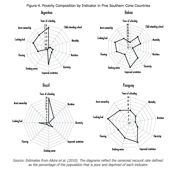
Of course, it is important to mention that there were some limitations of the data for the MPI. For example, child school attendance was a missing indicator in Brazil, Paraguay, and Uruguay because the World Health Survey does not collect data on that variable. Adjustments were made in the weight of the indicator of the education dimension. Nevertheless, this report is significant because countries’ poverty traps are finally quantified on a more thorough and meaningful level. This research explains that there are many factors that lead to a level of poverty that is hard to overcome without outside intervention, not just income levels. Poverty varies from country to country, and there is no one size fits all policy to alleviate. Conducting this research in more specific areas around the world could help policymakers more precisely target the causes for the poverty of their constituents. For example, according to the graph above, Brazil would likely benefit from an initiative to get children to go to school longer, while Bolivia would benefit more from attempting to improve sanitation. These analyses truly could lead to more effective poverty alleviation attempts.
Hello Ms. Kraus. Great post on MPI and the recent report from Emma Santos. Regarding the mathematical analysis, I must admit I have trouble grasping that too, but I think you might benefit from a different perspective described in Debraj Ray’s textbook “Development Economics” (1998). Chapter 8 and its appendix deals explicitly with Poverty and Nutrition measures, and you’ll hear echoes of “Poor Economics” throughout. The interpretation Ray uses is helpful to me; the incidence of poverty is just how many fall below the poverty line that we have set (whether its a calorie count, nutritional index, income, or ‘deprivation’), and the intensity is how far that household is from the line. Many of the MPI measures are binary (they either burn clean fuel indoors or they do not), and I am a bit hesitant about defining “intensity” for them. As Emma Santos describes in her mathematical definition of intensity, the MPI goes around that through weighting, so you could think of that big A in section 1 as a weighted distance from being “not poor”.
I was surprised at the mention of Argentine education being listed a deprivation, but if I’m reading Figure 4 correctly, that Argentine educational deprivation (3ish) is low compared to the Brazilian, Bolivian, and Paraguayan deprivation. Am I reading that correctly? Anecdotally I recall that one of the main problems in Argentina is what to do once you have a degree, not necessarily in getting it; but again I could be very wrong on that.
My last question would be what is the value of aggregating the components of the MPI as opposed to a “dashboard” method of analyzing them all separately? Ray (1998) uses “work capacity” (caloric intake) on the Y-Axis and health on the X-axis and still describes an S-shaped poverty trap through it. I think you could run a similar “ceteris peribus” exercise with all the individual components of the MPI. Some of these components also have strong correlations to per capita income, so is the analysis of MPI better than say per capita income adjusted for inequality?
Thank you! I’ve just began to dabble into this subject, so I’m still working to understand these concepts more thoroughly. Thank you for the book recommendation, I will definitely look into it to get another point of view.
Thank you for noticing my mistake – Argentina’s deprivations are both living standards and education, while Brazil’s is primarily just education, so I revised accordingly.
Regarding your last question, I’d definitely be interested in looking further into attempting a “ceteris peribus” exercise in the near future. I do, nevertheless, believe that aggregating the components is important because most countries show a combination of deprivations.
Dear Miranda,
I am currently a co-author of a danish Educational book titled ‘Global Development’ (translated), in which I am writing a chapter about extreme inequality and poverty. It is a non-profit project piloted by students from Cambridge University, aiming to share knowledge about issues related to international development.
In relation to this, I have come about your illustration of the poverty trap.
May I use this illustration in the book?
In the nature of things, we do not have lots of economic ressources to write this book.
But I hope, that you want to be a part of this proces, and support a good cause by letting us use your illustration.
Best regards
Mathias Munk Schmidt