
Excuse the goofy and way awful pun of a title, but really, this post is just about fancy text!
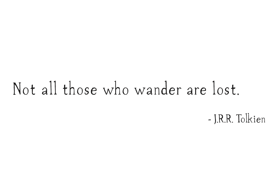
My most recent digital imaging project is surrounding typography–art that involves printing type–fun letter play! We were to pick a quote or selection of text that had some sort of meaning to it, find a typeface that caught our eye and captured our meaning, and then arrange the text in three ways: one simply for legibility, one for expressiveness, and one for visual effect (including images). The quote I chose is by one of my biggest inspirations, author of the Lord of the Rings series, J.R.R. Tolkien. Here’s part A!
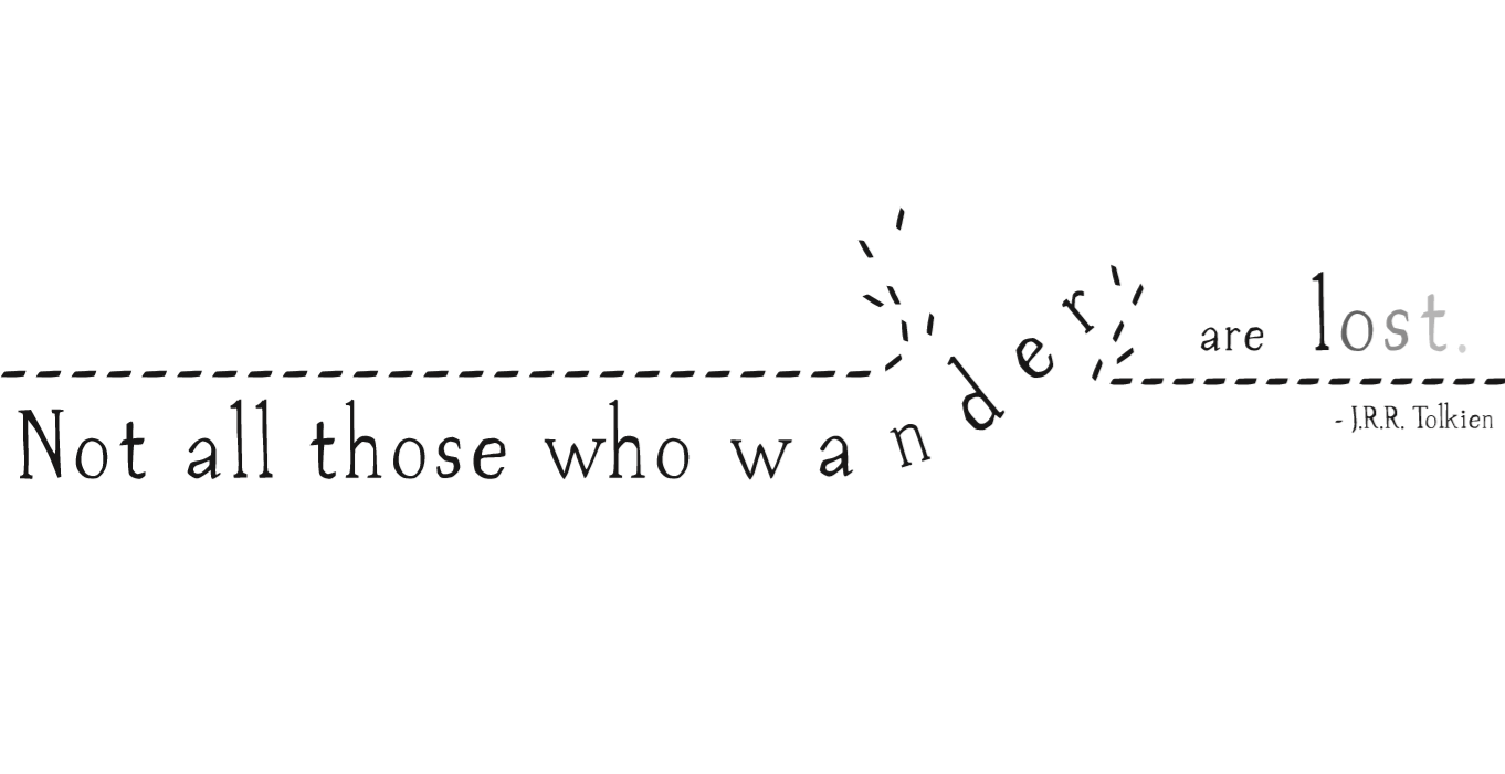
 I messed around with a couple different takes on the expressive step of part B. Here’s my favorite:
And for the third step, involving imagery, I did quite a bit of experimenting and ended up with this:
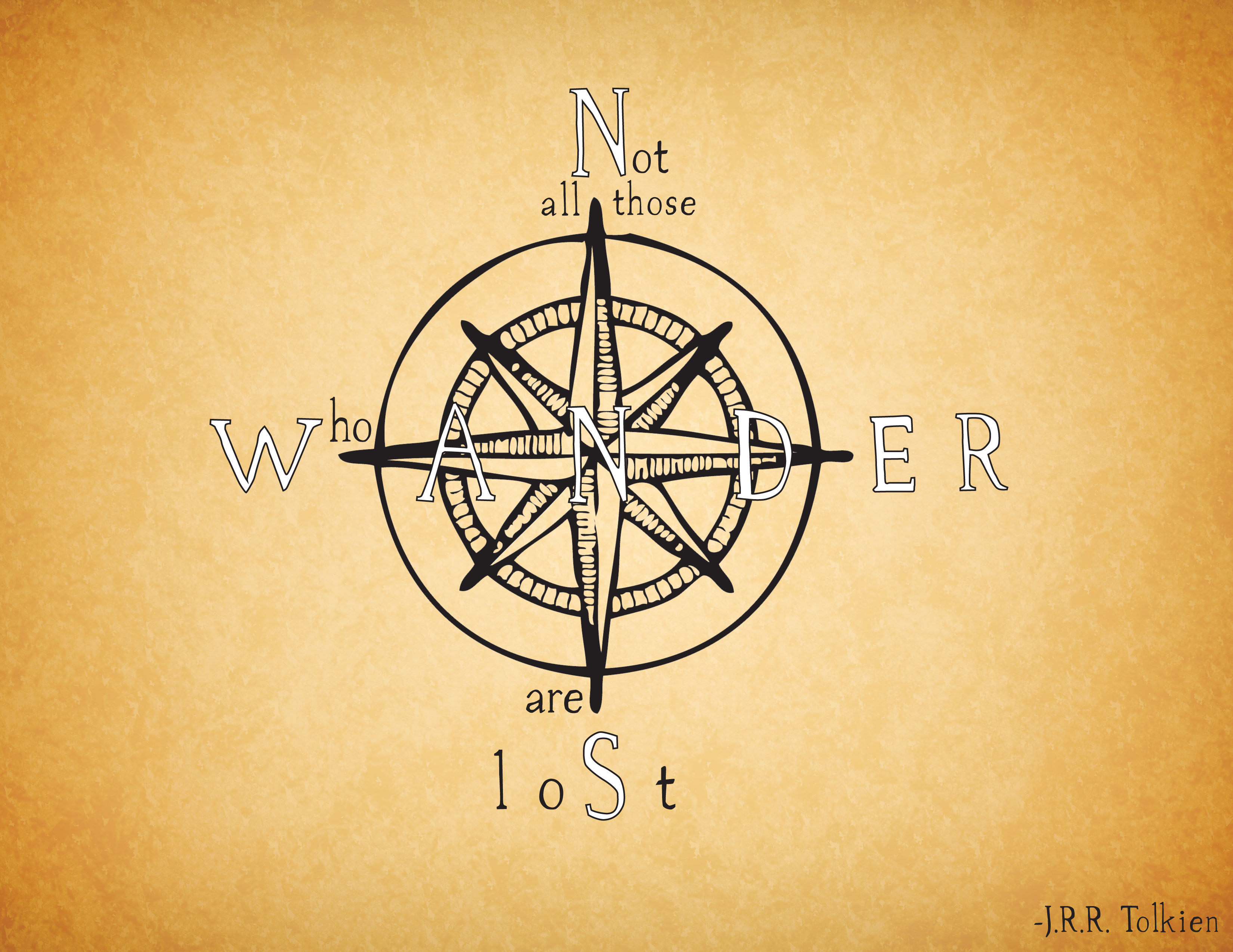
Next, I’ve decided to take the third piece into the real word! I’ll be creating a 3d compass with the text for the quote inside. I’ll be sure to upload a picture when I’m done, it’s a lot of work but it should come out pretty cool! (I hope!)